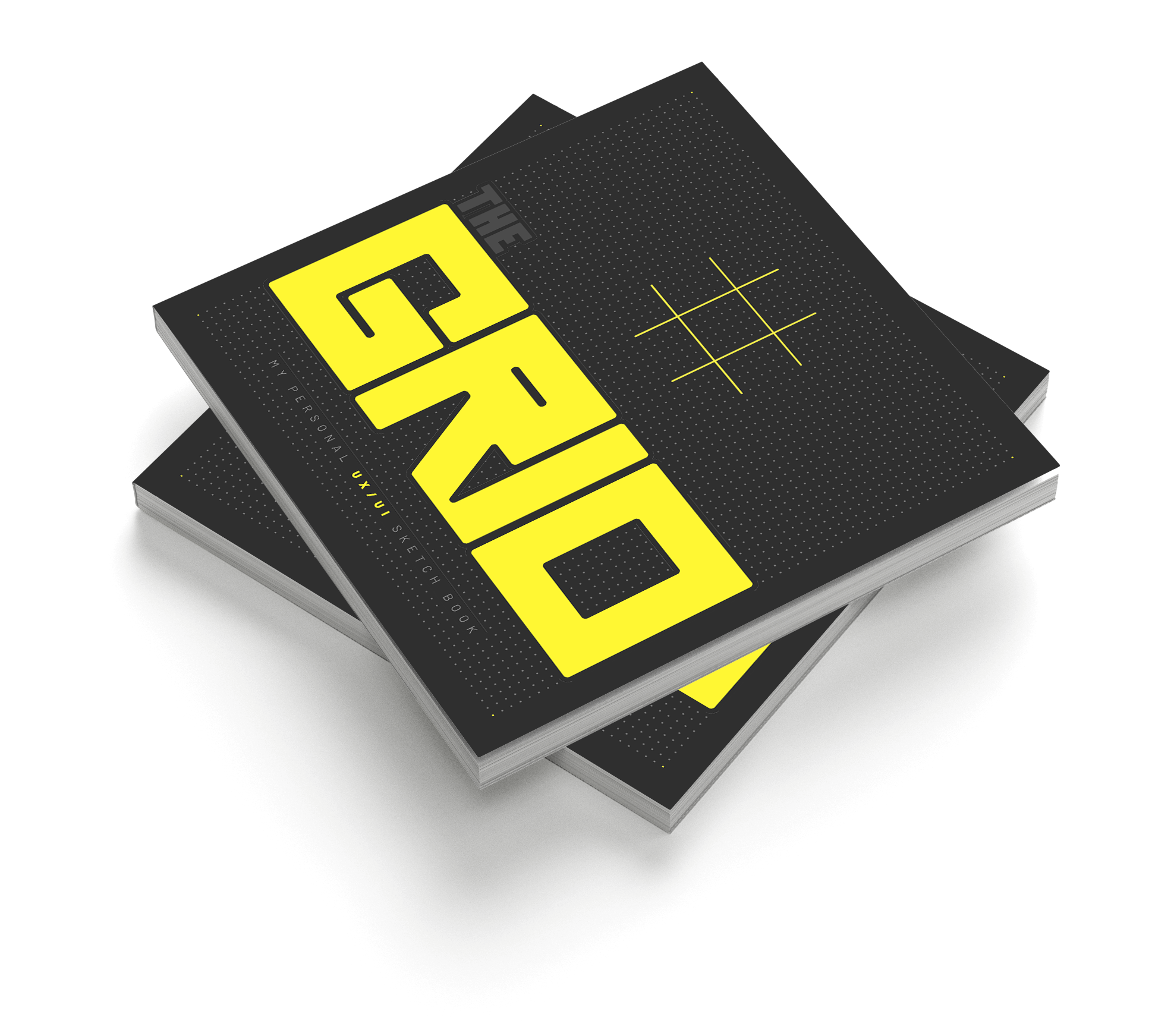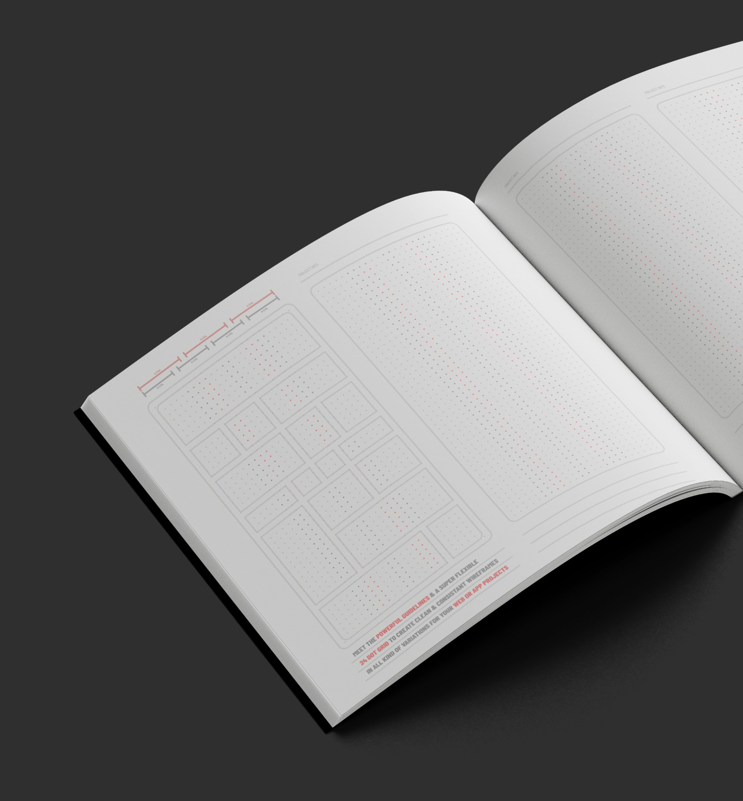

One of the unique features of THE GRID is its visual guidelines. These guidelines make it simple to work with different columns, a common challenge in design work. It enables designers to bring precision to their sketches, making their concepts more coherent and easier to present and implement.


The flexibility of THE GRID is another key feature that sets it apart. The sketchbook is tailored with 24 dots per screen, a versatile setup accommodating nearly all design scenarios. This feature maximizes convenience and allows designers to sketch out different UX/UI concepts without constraints.

